
Web Design & Development, Branding, Photography, Graphics
Nelson Public Library
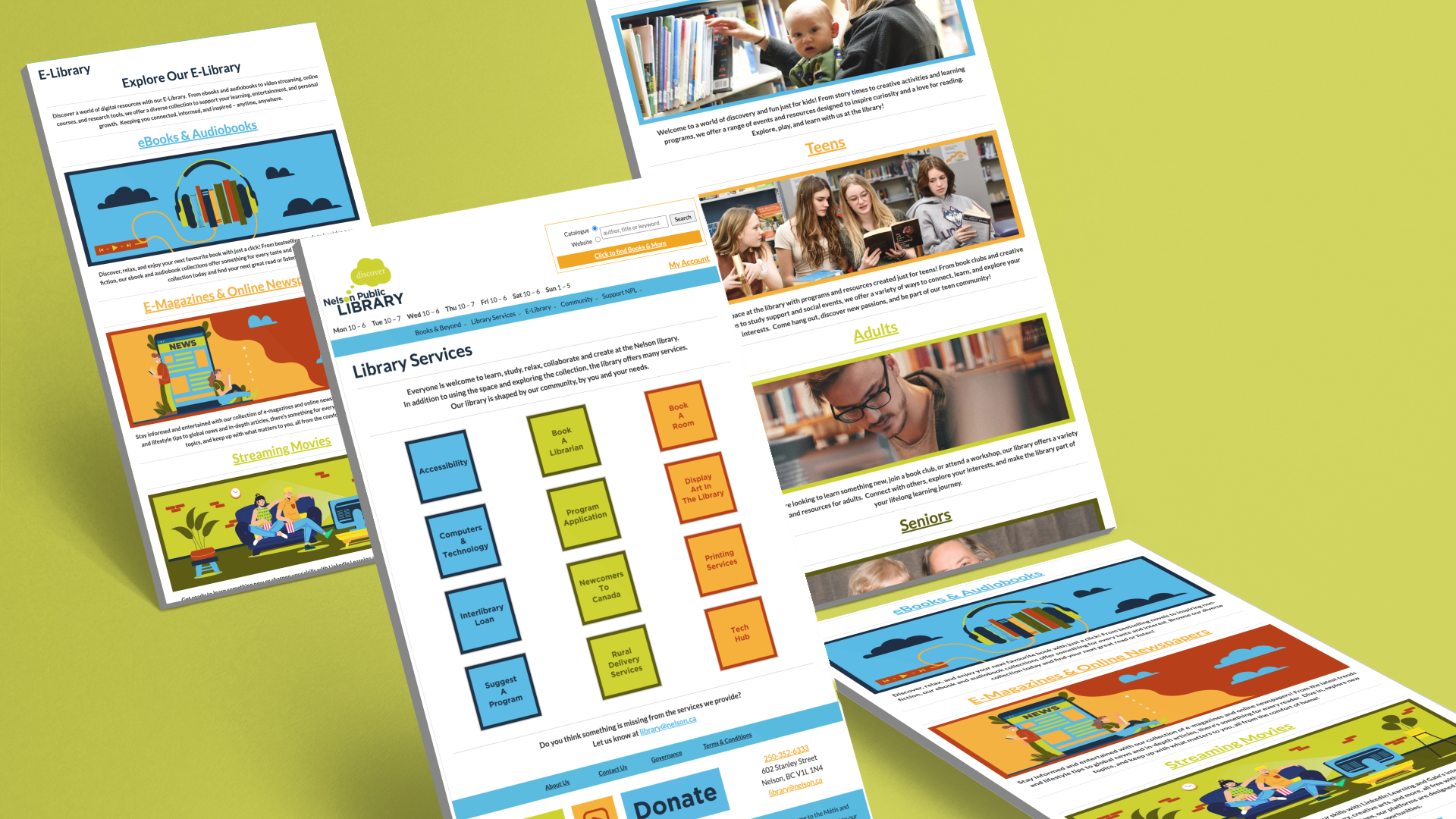
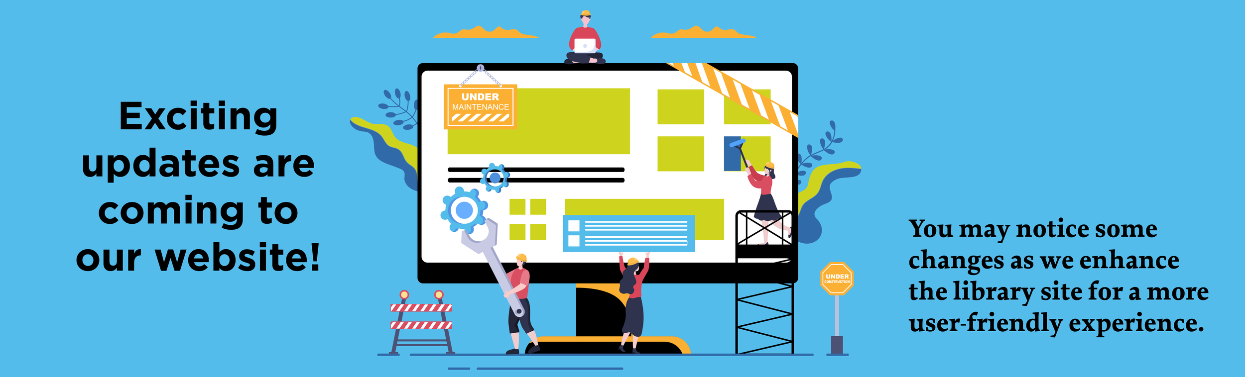
The Nelson Public Library partnered with me to modernize their Libpress website and refresh their branding, with a focus on accessibility, clarity, and ease of use for both staff and patrons. Designed with the community in mind, the new site brings the vibrancy of NPL’s programs and services to the forefront through intuitive layouts, custom graphics, and engaging visuals.
Alongside the redesign, I rebuilt their branding kit with updated logos, an extended accessible colour palette, a refined font stack, and new submarks along with some fun graphic development and photography to help share the library’s story. The project was delivered with a clear maintenance plan and training resources to help staff keep things running smoothly.


The Deliverables
• Website Audit
• Website Design & Dev
• Architecture & Sitemap
• Accessibility Enhance
• UX Design
• Content Restructure
• Visual Landing Page Creation
• Admin Training & Support
• Custom Graphics & Photography
• Full Branding Refresh
The Challenge
The Nelson Public Library needed a website refresh that would meet accessibility standards, be more intuitive for visitors and easier for staff to maintain. Over time, the site had grown to over 130 pages, many of which held overlapping or outdated content. The goal was to streamline the experience, improve navigation, and bring the site in line with current accessibility best practices. In addition, the existing branding assets were limited in format and scope, which presented an opportunity to expand the visual identity while preserving the library’s recognizable look and feel.


~ Laura Harris, Assistant Chief Librarian
“Dev was fantastic to work with! Making information about the library more accessible was the main goal of the website redesign. We had accumulated too much information on our pages and didn’t know how best to organize our site. Dev quickly embraced our mission and values as an organization and helped us understand what to highlight. She ensured library staff members felt confident in navigating the new site, its backend, and all of the great assets she designed. We’re very happy with how it turned out and would absolutely work with Dev again on a future project.”
The Strategy
Accessibility, clarity, and long term usability guided the entire project. I restructured the site’s main navigation into five clear, intuitive categories and condensed site pages into a streamlined, organized structure. This not only made the site easier to navigate but also significantly reduced maintenance demands.
To bring the library’s energy and personality forward, I incorporated carousels, buttons, original photography, and fun graphics throughout. Footer navigation was added to improve flow and user access, and special attention was given to consistent formatting, visual hierarchy, and accessible colour contrast. The refreshed branding kit honoured the existing identity while expanding it to support a more vibrant and flexible presence across digital and print.


Let’s Create Together

View More Projects