


Web Design & Photography by Muse
Branding & Packaging by November Wild
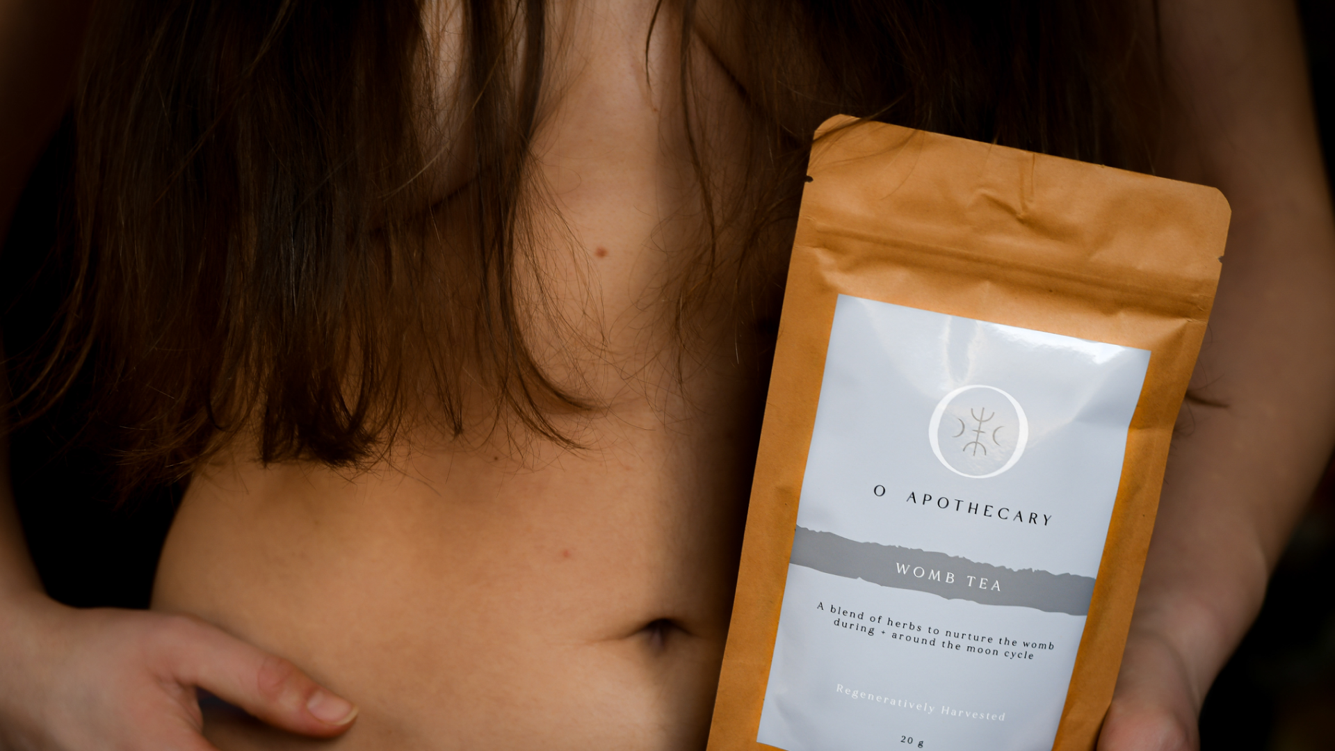
O Apothecary
A modern apothecary rooted in ancient traditions and the rhythms of nature. O Apothecary creates small batch botanical skincare, candles, and remedies using ethically harvested ingredients and regenerative practices. Their offerings are designed to nurture body and spirit, blending the wisdom of traditional plant medicine with a contemporary, elevated aesthetic.
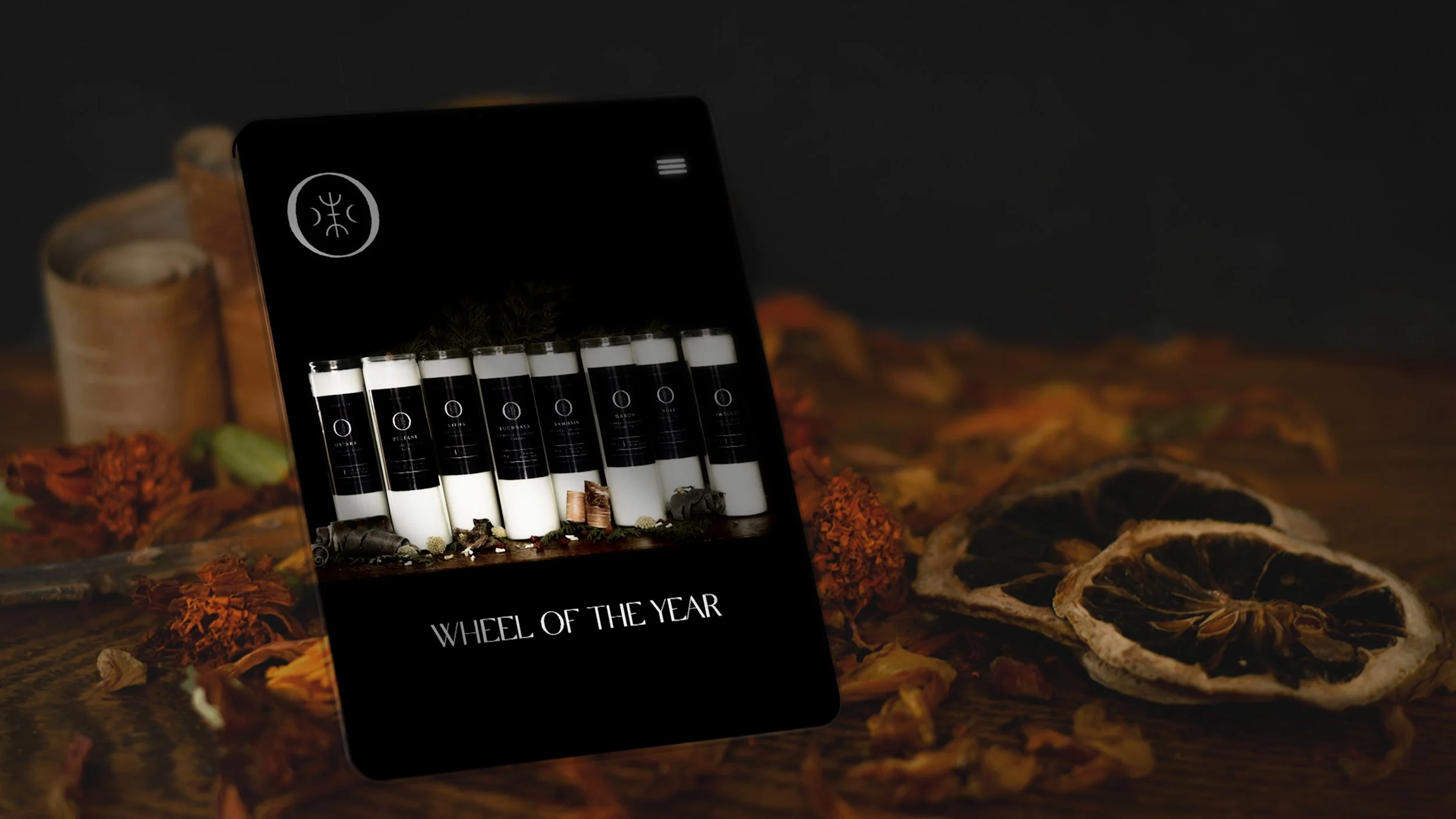
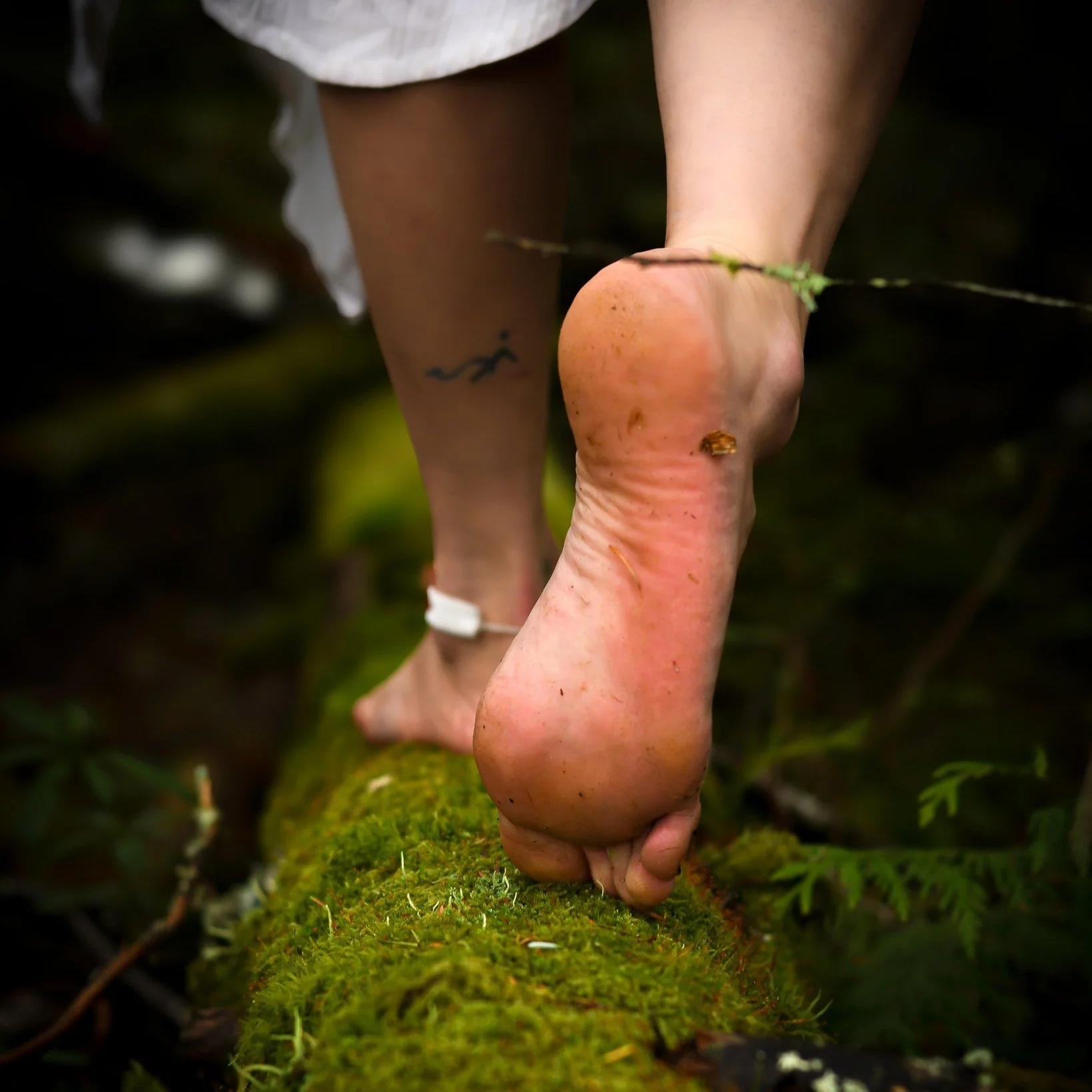
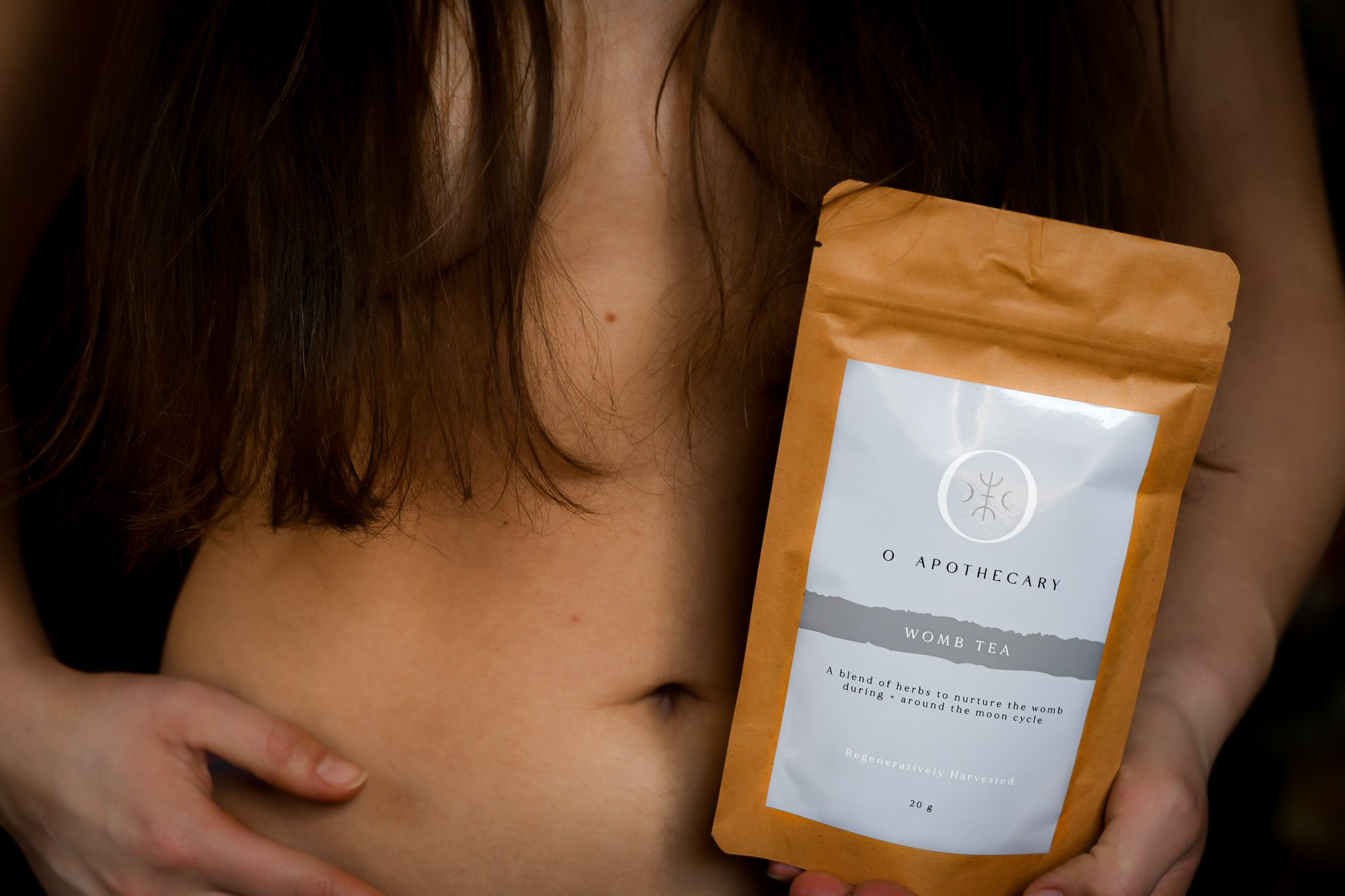
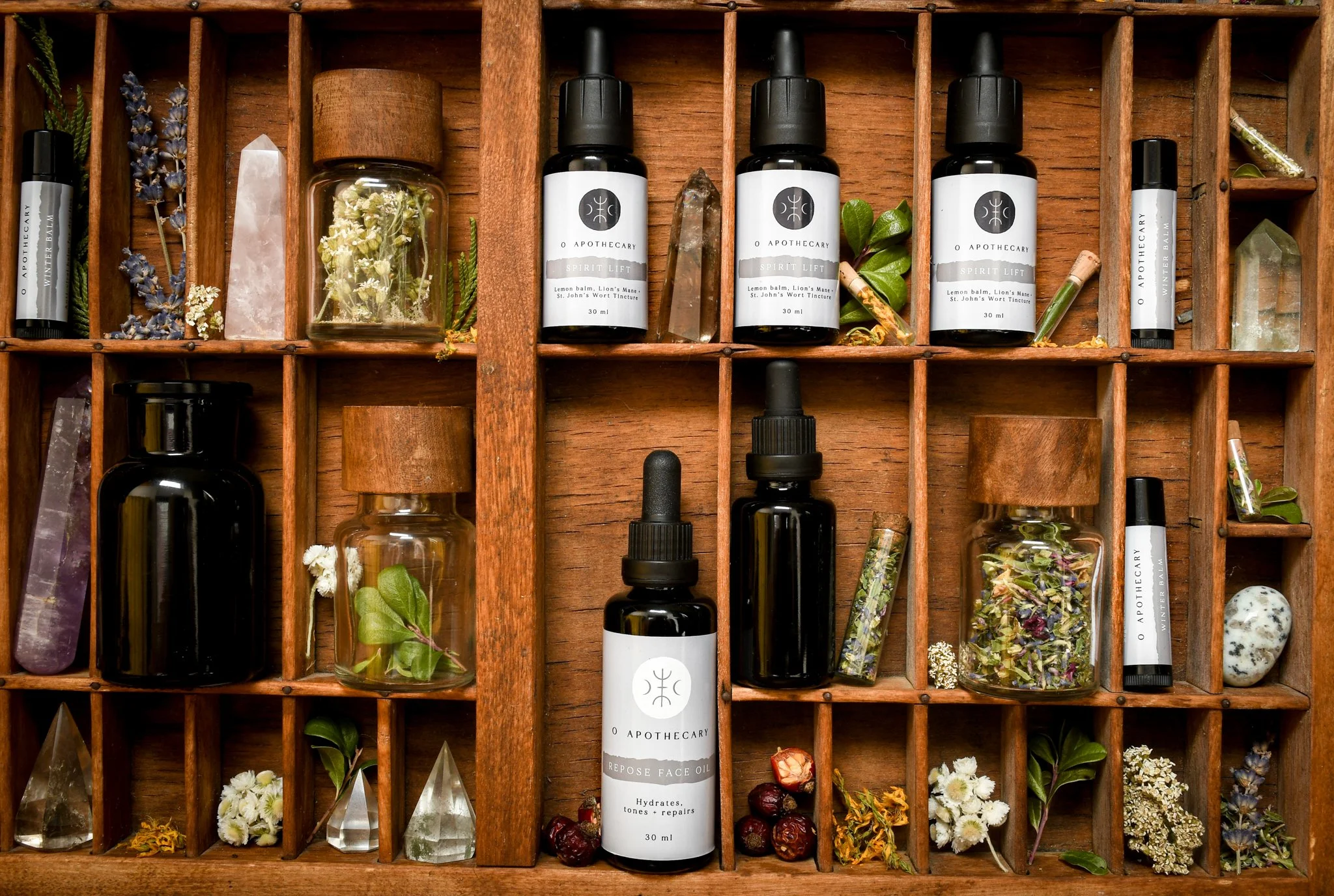
I designed and developed a fully custom Shopify store to mirror the brand’s refined, earthy style. The site pairs rich, moody visuals with intuitive navigation and a seamless shopping experience. The product photography was created specifically for this site, capturing essence, ritual, and the quiet beauty of nature’s details to create a consistent visual story across every page.


In the Making
• Shopify Website Dev
• Product Catalogue Curation
• Visual Styling
• Brand Photography
• UX and UI Design
• Collection & Product Pages
• App Integration
• Store Launch Setup
The Roots
Becky had built her first online store in Wix, figuring it out as she went, but it wasn’t giving her the functionality or the feel she wanted for O Apothecary. She was ready for a store that reflected the care and love she pours into every product.
We moved her to Shopify with a full rebuild in a premium theme, creating a site that feels intentional, warm, and true to her brand’s values. I photographed her entire product line, curated the catalogue, and structured the store to guide visitors naturally through her offerings.
The experience was designed to invite visitors deeper into her world. We outlined her process, gave each candle its own ritual, and built a herbal glossary to add context and storytelling to her products. Every element, from product presentation to page structure, was created to feel cohesive, inviting, and authentically O Apothecary.

~ Becky Miller, Potion Maker
“Dev, this is an incredible example of what you’re capable of creating for others.”
Let’s Create Together


Related Projects
Photography
